We are happy to announce the release of ggplot2 3.5.0. This is one blogpost among several outlining a new polar coordinate system. Please find the main release post to read about other exciting changes.
Polar coordinates are a good reminder of the flexibility of the Grammar of Graphics: pie charts are just bar charts with polar coordinates. While the tried and tested
coord_polar() has served well in the past to fulfill your pie chart needs, we felt it was due some modernisation. We realised we could not adapt
coord_polar() to fit with the
new guide system without severely breaking existing plots, so
coord_radial() was born to give a facelift to the polar coordinate system in ggplot2.
Relative to
coord_polar(),
coord_radial() can:
- Draw circle sectors instead of only full circles.
- Avoid data vanishing in the centre of the plot.
- Adjust text angles on the fly.
- Use the new guide system.
An updated look
The first noticeable contrast with
coord_polar() is that
coord_radial() is not particularly suited to building pie charts. Instead, it uses the scale expansion conventions like
coord_cartesian(). This makes sense for most chart types, but not pie charts. Nonetheless, you can use the expand = FALSE setting to use
coord_radial() for pie charts.
library(ggplot2)
library(patchwork)
library(scales)

pie <- ggplot(mtcars, aes(y = factor(1), fill = factor(cyl))) +
  geom_bar(width = 1) +
  scale_y_discrete(guide = "none", name = NULL) +
  guides(fill = "none")
default   <- pie + coord_radial() + ggtitle("default")
no_expand <- pie + coord_radial(expand = FALSE) + ggtitle("expand = FALSE")
polar     <- pie + coord_polar() + ggtitle("coord_polar()")

default | no_expand | polar
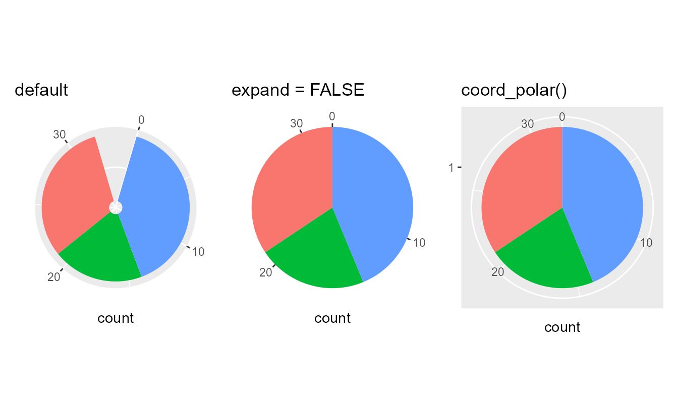
Some visual differences stand out in the plots above. In
coord_radial(), the panel background covers the data area of the plot, not a rectangle. It also does not have a grid-line encircling the plot and instead uses tick marks to indicate values along the theta (angle) coordinate. You may also notice that
coord_polar() still draws the radius axis, despite instructions to use guide = "none". That is the integration with the guide system that birthed
coord_radial().
Partial polar plots
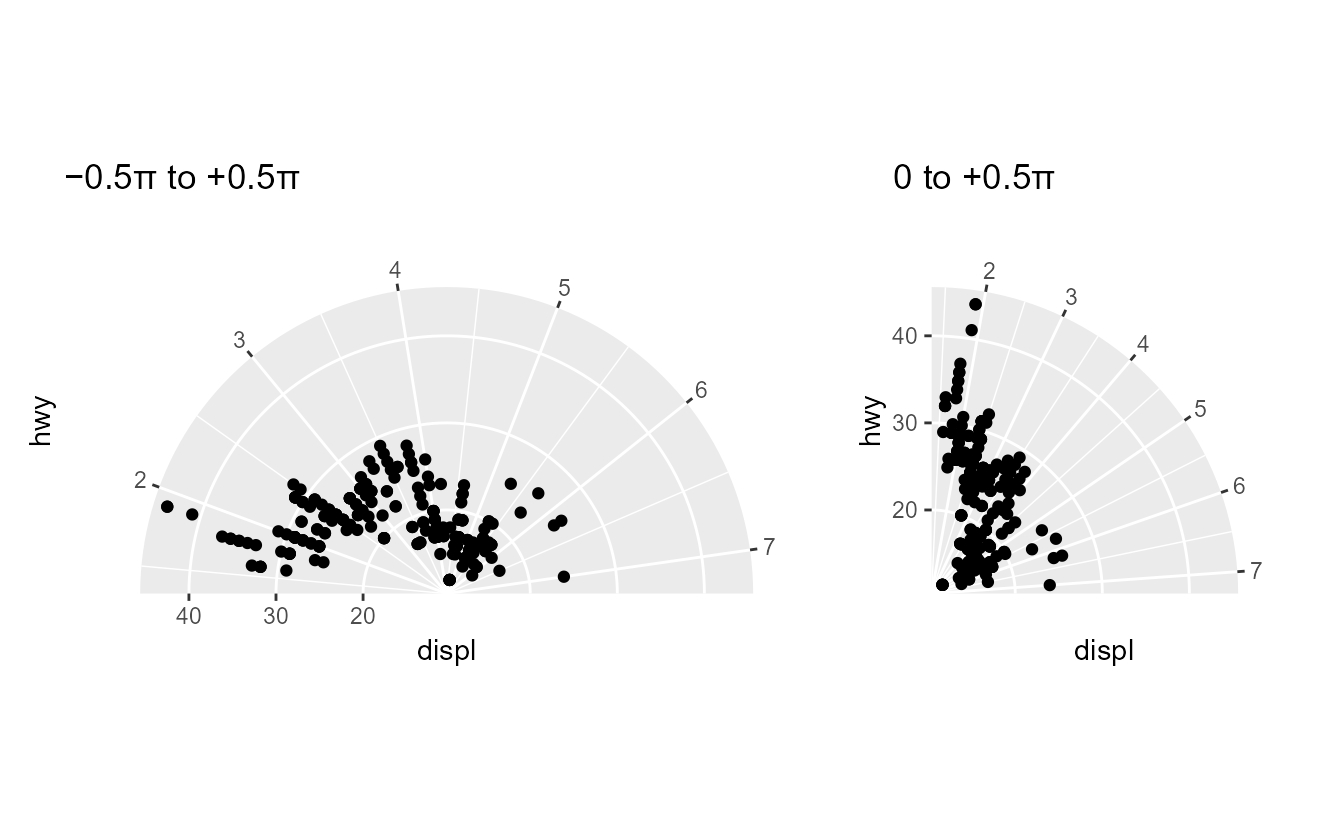
Another important difference is that
coord_radial() does not necessarily need to display a full circle. By setting the start and end arguments separately, you can now make a partial polar plot. This makes it much easier to make semi- or quarter-circle plots.
p <- ggplot(mpg, aes(displ, hwy)) +
  geom_point()

half <- p + coord_radial(start = -0.5 * pi, end = 0.5 * pi) +
  ggtitle("−0.5π to +0.5π")
quarter <- p + coord_radial(start = 0, end = 0.5 * pi) +
  ggtitle("0 to +0.5π")
half | quarter
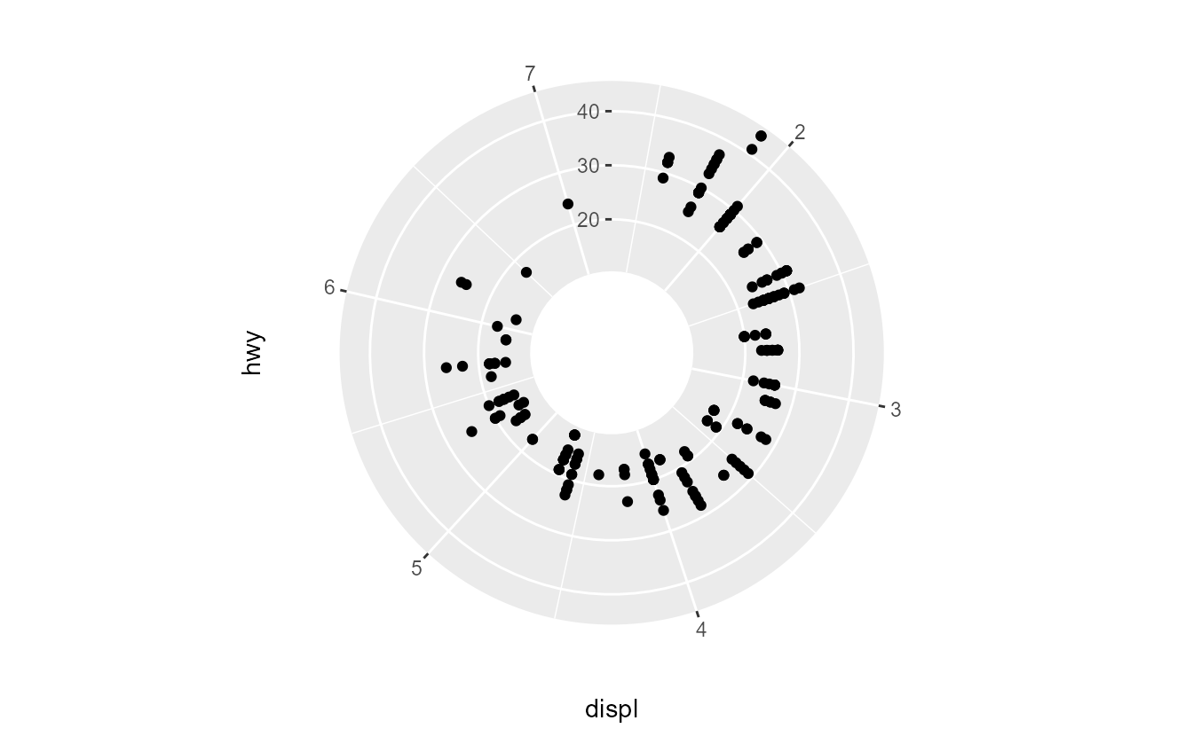
Donuts
It was already possible to turn a pie-chart into a donut-chart with
coord_polar(). This is made even easier in
coord_radial() by setting the inner.radius argument to make a donut hole. For most plots, this avoids crowding data points in the center of the plot: points with a widely different theta coordinate but similarly small r coordinate are placed further apart.
p + coord_radial(inner.radius = 0.3, r_axis_inside = TRUE)
Text annotations
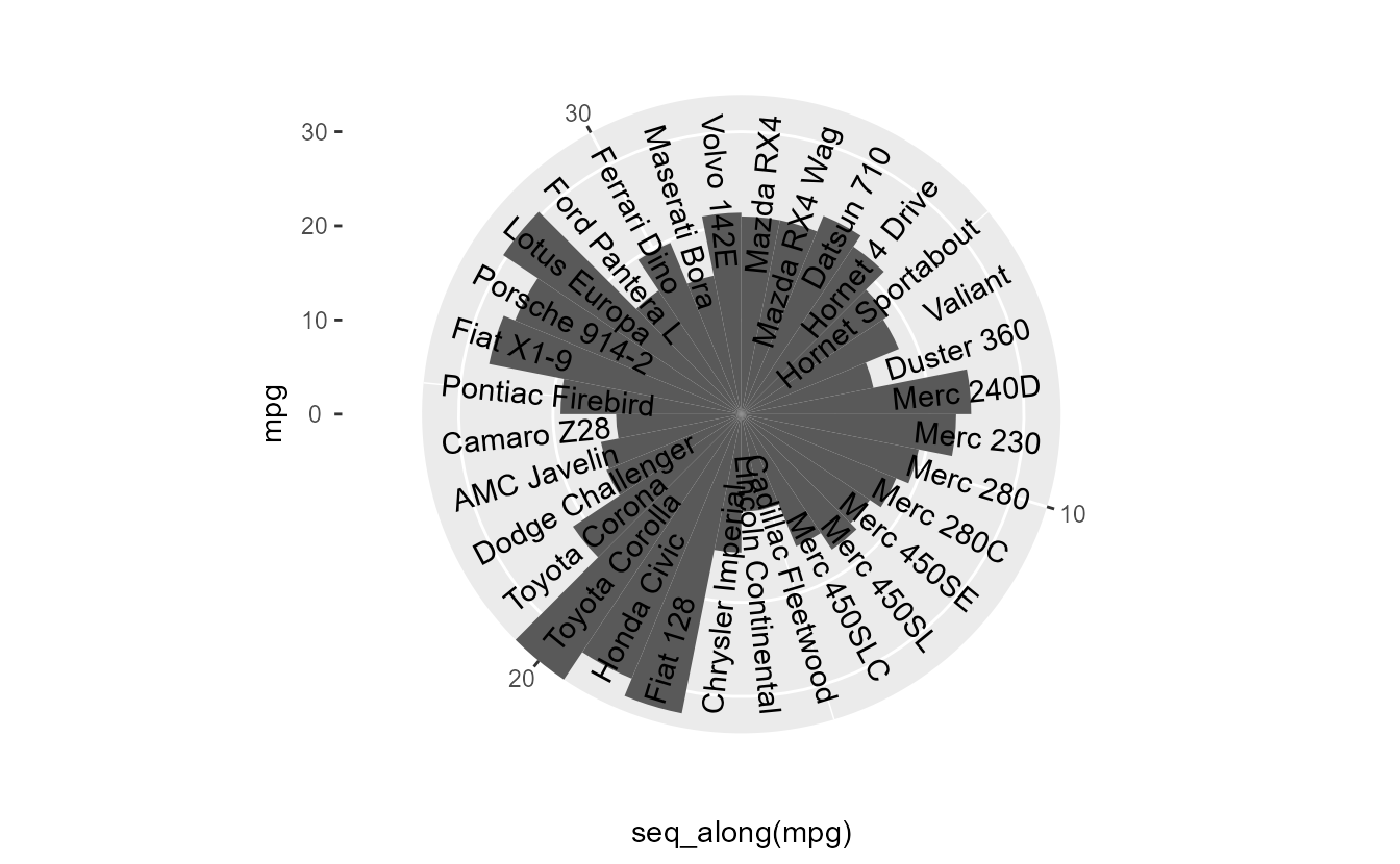
A common grievance with about polar coordinates is that it was cumbersome to rotate text annotations along with the theta coordinate. Calculating the correct angles for labels is pretty involved and usually changes from plot to plot depending on how many items need to be displayed. To remove some of this hassle
coord_radial() has a rotate_angle switch, that will line up the text’s angle aesthetic with the theta coordinate. For text angles of 0 degrees, this will place text in a tangent orientation to the circle and for angles of 90 degrees, this places text along the radius, as in the plot below.
ggplot(mtcars, aes(seq_along(mpg), mpg)) +
  geom_col(width = 1) +
  geom_text(
    aes(y = 32, label = rownames(mtcars)),
    angle = 90, hjust = 1
  ) +
  coord_radial(rotate_angle = TRUE, expand = FALSE)
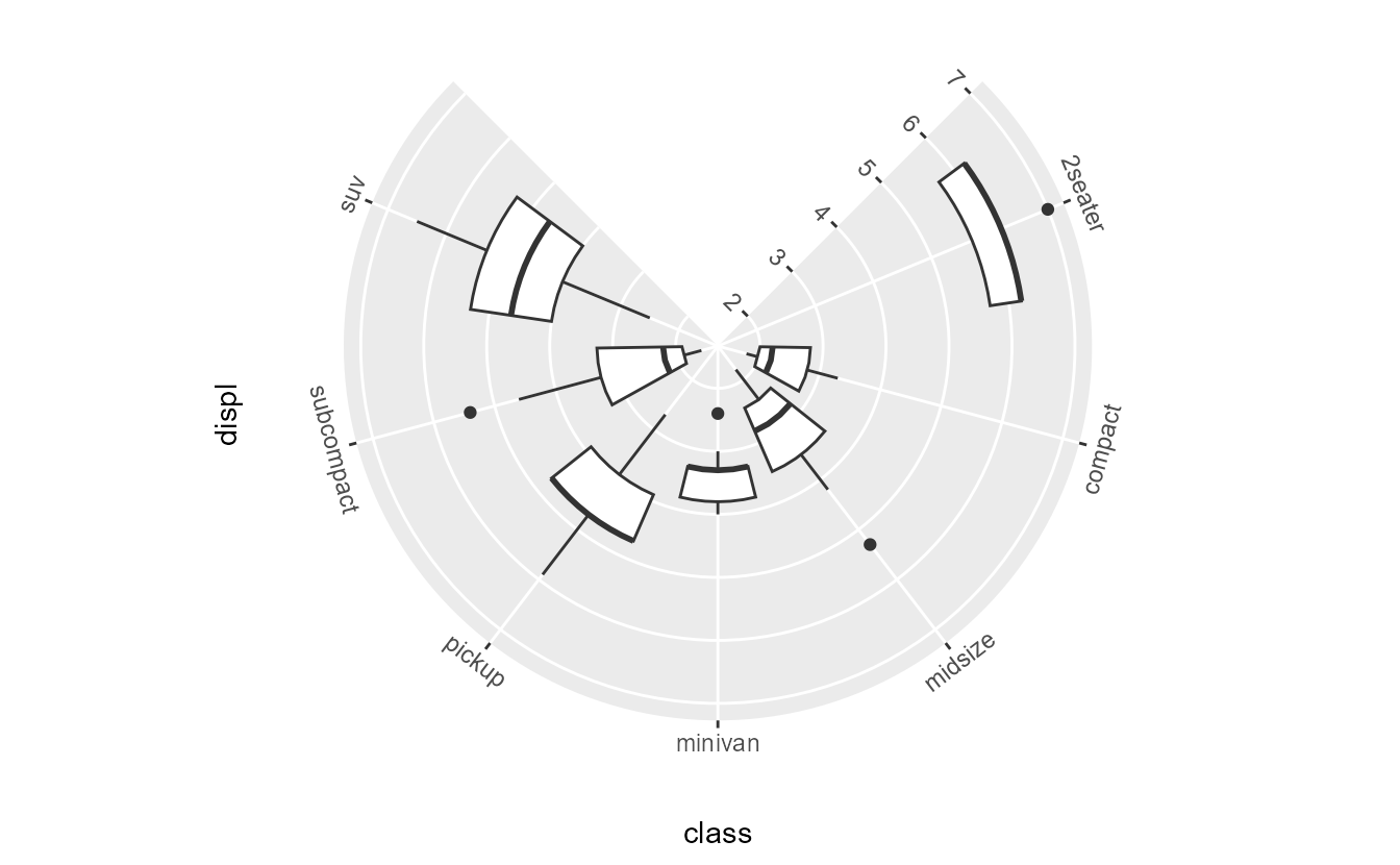
Axes
Because the logic of drawing axes for polar coordinates is not the same as when axes are perfectly vertical or horizontal, we used the new guide system to build an axis specific to
coord_radial(): the
guide_axis_theta() axis. Guides for
coord_radial() can be set using theta and r name in the
guides() function. While the r axis can be the regular
guide_axis(), the theta axis uses the highly specialised
guide_axis_theta(). The theta axis shares many features with typical axes, like setting the text angle or the new minor.ticks and cap settings. More on these settings in the
axis blog. As seen in previous plots, the default is to place text horizontally. One neat trick we’ve put into
coord_radial() is that we can set a relative text angle in the guides, such as in the plot below.
ggplot(mpg, aes(class, displ)) +
  geom_boxplot() +
  coord_radial(start = 0.25 * pi, end = 1.75 * pi) +
  guides(
    theta = guide_axis_theta(angle = 0),
    r     = guide_axis(angle = 0)
  )
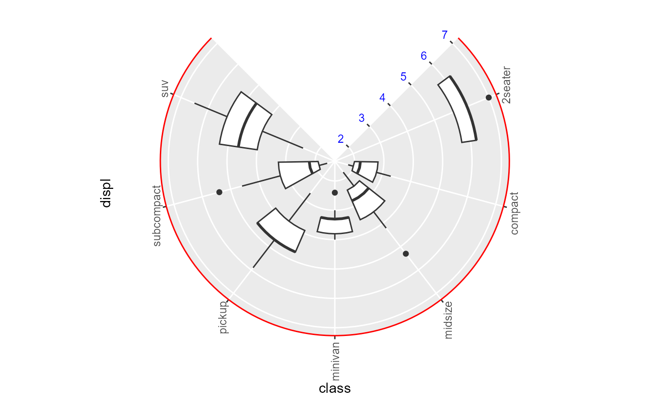
The theme elements to style these axes have the theta or r position indication, so to change the the axis line, you use the axis.line.theta and axis.line.r arguments. The theme settings can also be used to set the absolute angle of text.
ggplot(mpg, aes(class, displ)) +
  geom_boxplot() +
  coord_radial(start = 0.25 * pi, end = 1.75 * pi) +
  theme(
    axis.line.theta = element_line(colour = "red"),
    axis.text.theta = element_text(angle = 90),
    axis.text.r     = element_text(colour = "blue")
  )
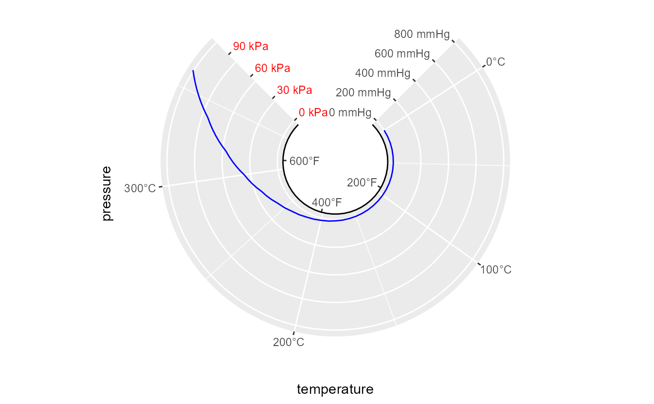
Lastly, there can also be secondary axes. We anticipate that this is practically never needed, as grid lines follow the primary axes and without them, it is very hard to read from axes in polar coordinates. However, if there is some reason for using secondary axes on polar coordinates, you can use the theta.sec and r.sec names in the
guides() function to control the guides. Please note that a secondary theta axis is entirely useless when inner.radius = 0 (the default). There are no separate theme options for secondary r/theta axes, but to style them separately from the primary axes, you can use the theme argument in the guide instead.
ggplot(pressure, aes(temperature, pressure)) +
  geom_line(colour = "blue") +
  scale_x_continuous(
    labels = label_number(suffix = "°C"),
    sec.axis = sec_axis(~ .x * 9/5 + 35, labels = label_number(suffix = "°F"))
  ) +
  scale_y_continuous(
    labels = label_number(suffix = " mmHg"),
    sec.axis = sec_axis(~ .x * 0.133322, labels = label_number(suffix = " kPa"))
  ) +
  guides(
    theta.sec = guide_axis_theta(theme = theme(axis.line.theta = element_line())),
    r.sec = guide_axis(theme = theme(axis.text.r = element_text(colour = "red")))
  ) +
  coord_radial(
    start = 0.25 * pi, end = 1.75 * pi,
    inner.radius = 0.3
  )